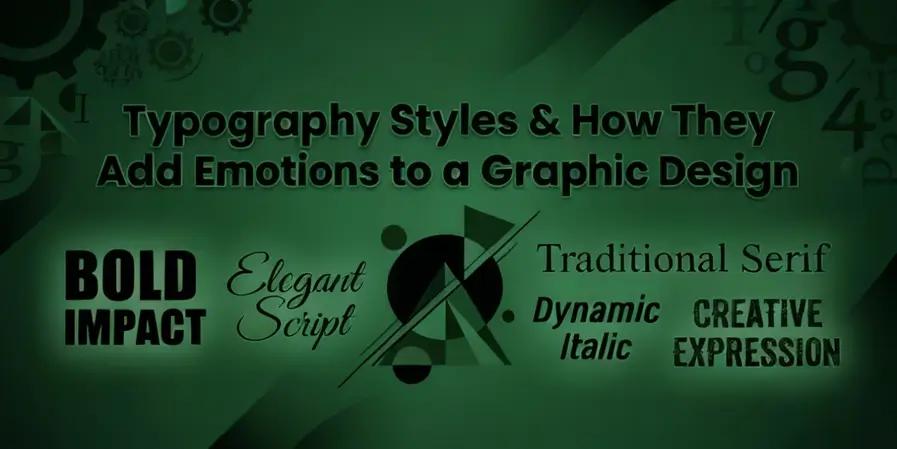
Typography Styles & How They Add Emotions to a Graphic Design
The most valuable item in a graphic designer’s toolkit is typography. If you disagree, please go back in your memory and answer this question. What was the last time you scrolled past an ad?
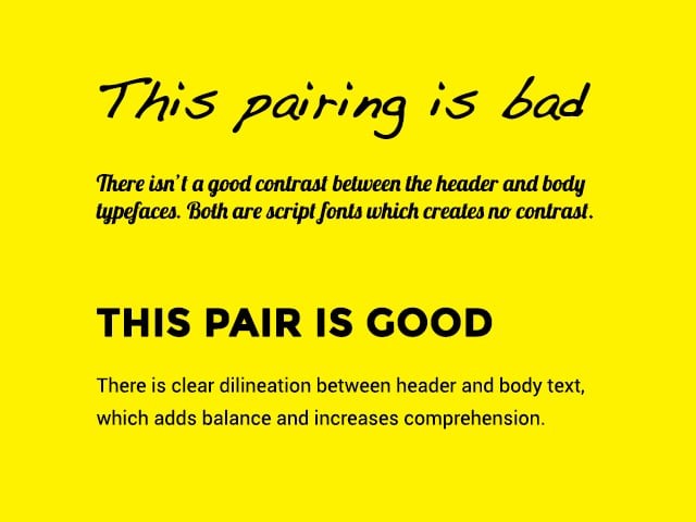
Did you stop because the words looked bold, clean, and inviting like this?

Or did you just swipe away because they felt messy and hard to read, like this one?

That moment when you decided to read or skip, it wasn’t random. It was typography and arabic typography doing its job. And it’s not just happening on your feed.
From the graphic designers in UAE to Canada and even in the UK, they have all started to rely more on typesetting in their projects. After all, this is what makes sure that the messages are received, trusted, and remembered. Let’s dig in deeper.
Understanding How Typography Speaks in Visual Language
Fonts do carry personality, and once you notice that, you will start spotting how every letter is working to pull you in or push you away. They are the real game-changers because just look at how they can set the mood and quietly decide whether one should trust what they are seeing.
- Warning: if you continue to read, you might never look at any text the same way again.
What Exactly is Typography in Design? Let’s Discuss
It is the system that lets any type of content function. For instance, by setting the pace, establishing the required tone, and guaranteeing trust before a single sentence is understood.
- The spacing and alignment show how professional a brand is.
- The weight and contrast decide the urgency of the message.
- The texture and scales help them become familiar effortlessly.
However, all of this understanding happens in a second, just by looking at the fonts. That is why many experts from the top-notch designing services Dubai claim that typography is no longer a decoration. It helps the design come across a comprehensible.
5 Characteristics That Make It So Important
- Clarity: Clean letterforms and sane spacing are critical to reduce the cognitive load on a reader’s mind. Or else they might keep struggling to decode the message.
- Hierarchy: Only the experienced designer understands that typography is done best when it guides the eye. Also, when it is bigger and bolder, it tends to highlight important news. However, the smaller text is usually meant to support detail. This characteristic of the typesetting lets readers know what to read first and keeps information organised.
- Consistency: When the rules of effective typesetting are followed, it becomes easier for the audience to recognise the brand instantly and trust it. Hence, every single style and space is a game-changer according to the knowledgeable graphic designers in UAE.

- Personality: We highlighted earlier, too, that fonts carry mood. This is why a serif feels traditional, but a sans‑serif feels modern. This trait helps the brand in inviting audiences to connect with them through a voice that feels unique and memorable.
- Emotion: Different fonts can make the audience feel different emotions, such as warm, bold, serious, or playful. This particular aspect of the typography turns plain text into memorable experiences. As a result, people remember it for a longer time.
The Effect of Typesetting on the Overall Readability
It is evident that the fonts are directly related to the readability score of any content. Be it a poster, an advertisement, a brochure, or a basic newspaper, a few rookie mistakes can ruin the message. Or worse, might even backfire. Therefore, you must keep track of 3 things:
- The line length
- The line height
- Paragraph spacing
However, managing it can be tricky. So, always aim for the optimal ranges (roughly 55–75 characters per line) for a balanced message speed and accuracy. Though if you still feel clueless after a few attempts, it is better to hire someone from a reliable graphic design company. Their in-house experts are well aware of the drill.
Differentiating Between a Typeface and a Font
| Aspect | Typeface | Font |
| Definition | The overall design style of letters, numbers, and symbols. | A specific style, weight, or size within that typeface. |
| Example | Helvetica (the complete design system) | Helvetica Bold 12pt (a particular cut of Helvetica) |
| Scope | Broad, abstract design idea that includes all variations. | Narrow, concrete instance that is used in actual text. |
| Role in Design | Sets the voice and personality of text. | Provides the exact look and feel for practical use. |
Breaking Down the Typographic Hierarchy
To understand the hierarchy, know a simple logic first that says readers scan before they read. It is true. If the headlines do not promise any unique value, there are lesser chances of the audience continuing the read further. Moreover, your design should have a coherent type scale (e.g., modular steps) to ensure predictable jumps in attention.
In simple words, a good hierarchy helps reduce the reader’s decision time. It lets them identify relevance quickly. On the other hand, a bad hierarchy forces them to look for the required information in the design, which is clearly a big failure for the brand.
FAQs
- How does typography contribute to brand identity?
Good or bad, every font gives a brand its voice. The right typeface, for instance, makes a company feel trustworthy. So, make sure whatever your brand theme is, you use it consistently to build recognition. This is important because mismatched fonts can confuse the reader.
2. What role does it play in digital design vs. print?
In digital design, the typesetting must adapt to screens, such as for scaling, readability, and responsiveness. However, in print, it focuses on precision. Collectively, both rely on hierarchy and clarity, but digital typography is way more flexible.
3. How is typography evolving with technology?
Believe it or not, the fonts are becoming smarter. For instance, the variable fonts allow one typeface to shift weight and style instantly. Responsive designs like these can make sure that the text looks good on any device. Also, the AI tools are helpful with customising the fonts according to user choice and comfort.
The Final Words!
To put it all together, here is what we have found: Typography is an integral part of graphic design, and without the right choices, the right message can never be delivered. Hence, it is 100% true that the way the letters are arranged, or the font they are in, makes all the difference between catching attention and being ignored. So, if you are still clueless about the appropriate pairing of fonts, you might want to connect with the professional graphic designers in UAE and create a stronger brand image in the market.
As a seasoned content creator for Creative Ink UAE, I write about everything from cutting-edge design tips to print marketing best practices. Drawing from experience with Dubai’s top design and printing agencies, I aim to educate and inspire business owners and creatives with blog posts that simplify complex topics and spark new ideas.

